> ## Documentation Index
> Fetch the complete documentation index at: https://docs.mapxagent.com/llms.txt
> Use this file to discover all available pages before exploring further.
# Charts
> Create charts from your layers and files with AI chat, style and pin them to the map, export them, and include them in reports.
Charts turn your layer and file data into visual evidence. Instead of building a chart by hand, describe it in chat — *"bar chart of revenue by category"* — and MapX generates it from the selected data source.
## Create a chart
Ask for the chart you need in the chat panel. MapX supports **bar, line, area, pie, donut, scatter, radar, funnel, treemap, heatmap, boxplot, and combo** charts. Combo charts mix bar, line, and area series and support a second y-axis.
Generated charts appear in the **Charts** panel with a thumbnail, title, and source. Each chart includes:
* an AI-written insight that states the main takeaway in one sentence;
* the source layer or file and the fields it was built from;
* the row count behind the chart, so you know what it represents;
* the chart type, shown next to the insight.
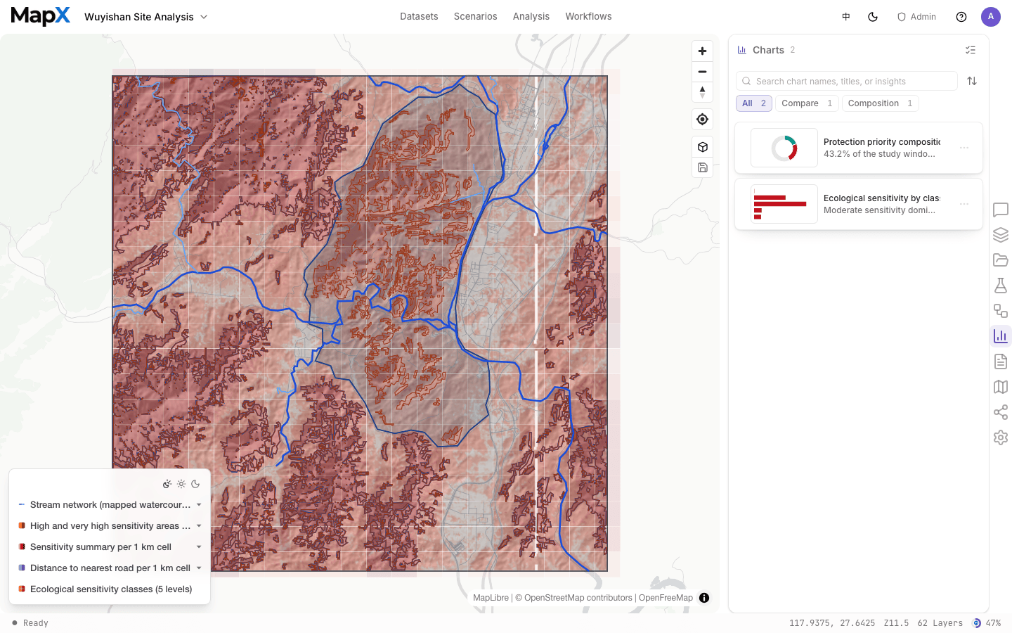 Use the panel search, sort, and purpose filters to find charts quickly. Each row repeats the chart type and its source under the title, so you can spot the chart you want without opening it.
## Style and manage charts
Click a chart row in the **Charts** panel to open the style editor. There you can:
* change the chart type or title;
* pick one of the nine named color palettes or define custom colors;
* configure series for combo charts, including which y-axis each series uses.
Saving applies the changes to the chart and keeps every view in sync.
Open the row actions menu (`⋯`) to:
* pin or unpin the chart on the map;
* export it as PNG, SVG, or CSV;
* edit the chart in the chat;
* duplicate or delete it.
## Pin a chart to the map
You can pin one chart to the map at a time. Choose **Pin** from the chart row menu, or click **Preview** on a chart in a chat message — both place the chart on the map.
The pinned card floats over the map and can be dragged and resized. Its position is saved with the project. When a chart is pinned, the chat automatically references it, so follow-up questions like *"explain this chart"* apply to it directly.
Click a category in a pinned chart to highlight the matching features on the map; click the same category again to clear the highlight. Unpin the chart to remove the highlight and free the space on the map.
## Export charts
Use the row actions menu to export a chart as **PNG, SVG, or CSV**. Exports use the chart's current style and are available for any chart in the panel.
## Charts in reports
Charts you create can be included in [reports](/en/concepts/reports). Reports embed the chart with its title, insight, and data source, so the chart stays traceable to its underlying data.
A chart is a snapshot of its data at generation time. If the underlying layer or file changes, update or regenerate the chart with the AI — or restyle the existing chart in the style editor.
This documentation is built and hosted on [Mintlify](https://mintlify.com), a developer documentation platform.
Use the panel search, sort, and purpose filters to find charts quickly. Each row repeats the chart type and its source under the title, so you can spot the chart you want without opening it.
## Style and manage charts
Click a chart row in the **Charts** panel to open the style editor. There you can:
* change the chart type or title;
* pick one of the nine named color palettes or define custom colors;
* configure series for combo charts, including which y-axis each series uses.
Saving applies the changes to the chart and keeps every view in sync.
Open the row actions menu (`⋯`) to:
* pin or unpin the chart on the map;
* export it as PNG, SVG, or CSV;
* edit the chart in the chat;
* duplicate or delete it.
## Pin a chart to the map
You can pin one chart to the map at a time. Choose **Pin** from the chart row menu, or click **Preview** on a chart in a chat message — both place the chart on the map.
The pinned card floats over the map and can be dragged and resized. Its position is saved with the project. When a chart is pinned, the chat automatically references it, so follow-up questions like *"explain this chart"* apply to it directly.
Click a category in a pinned chart to highlight the matching features on the map; click the same category again to clear the highlight. Unpin the chart to remove the highlight and free the space on the map.
## Export charts
Use the row actions menu to export a chart as **PNG, SVG, or CSV**. Exports use the chart's current style and are available for any chart in the panel.
## Charts in reports
Charts you create can be included in [reports](/en/concepts/reports). Reports embed the chart with its title, insight, and data source, so the chart stays traceable to its underlying data.
A chart is a snapshot of its data at generation time. If the underlying layer or file changes, update or regenerate the chart with the AI — or restyle the existing chart in the style editor.
This documentation is built and hosted on [Mintlify](https://mintlify.com), a developer documentation platform.