

What the scenario ships
Seven prepared layers cover Jakarta; the scenario’s default study window is Kota Jakarta Pusat (central Jakarta).
All layers come from the built-in catalog with source and attribution attached, and they are not limited to Jakarta: the catalog provides the same datasets for other cities at the same specification — switch the study area, add the same entries, and this chapter’s method chain transfers in minutes.
How the study works
In short, the study first computes a walking service area for each of the three facility classes and crosses it with neighbourhood population to produce three shortfall layers of residents outside the circle; it then assembles the shortfalls into one neighbourhood table and ranks the neighbourhoods with the biggest gaps; finally a 2SFCA accessibility score measures how tight supply is inside the circle, cross-checking coverage against accessibility, and the run delivers rankings, a heatmap and a report.
Run it
The screenshots below come from this scenario’s reference workspace. Each step names the platform surface it uses, so you can follow the same path in your own project.1. Open the scenario
Open Scenarios in the top menu, select this card and choose Open scenario. The whole bundle imports at once: every layer keeps its default style, legend, source and attribution, and the camera flies to the study area. Use the Layers panel to switch layers on and off before you type anything.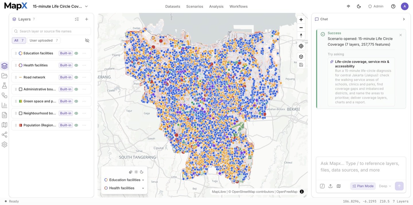
2. Ask the suggested question and review the plan
Send the suggested question in the box above — or edit it first. Plan mode asks the four decisions that change the answer — study unit, walking radius, supply assumption and deliverables — and fixes the rest, including the park definition, in the plan document.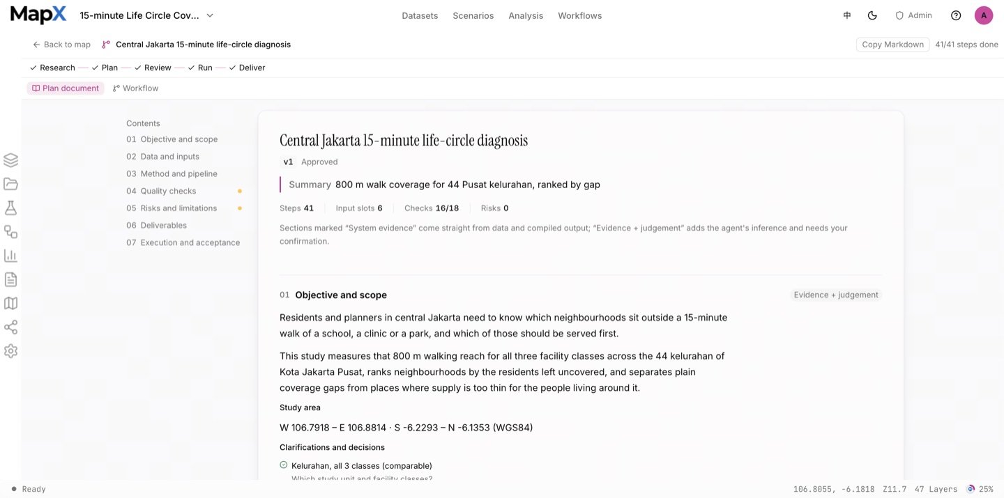
3. Approve the plan and run the analysis
The run uses selection, clipping and erasing to shape the study area, network service areas at 800 m for all three facility classes, zonal statistics to count the residents left outside, field calculations for the shortfall shares, the accessibility model (2SFCA) and a chained summary table. The graph shows every branch, including the three facility classes side by side. The Analysis panel keeps every run’s operator, inputs, parameters and result layer.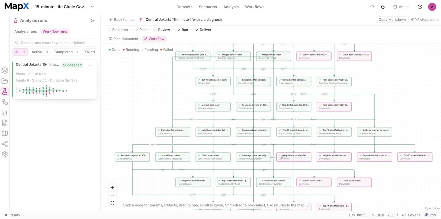
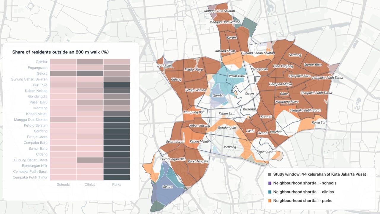
4. Style the result on the map
The three shortfall ramps share one break scale, so a dark purple and a dark teal mean the same share; the ADM4 boundary sits on top with neighbourhood labels, and blank space means inside the circle.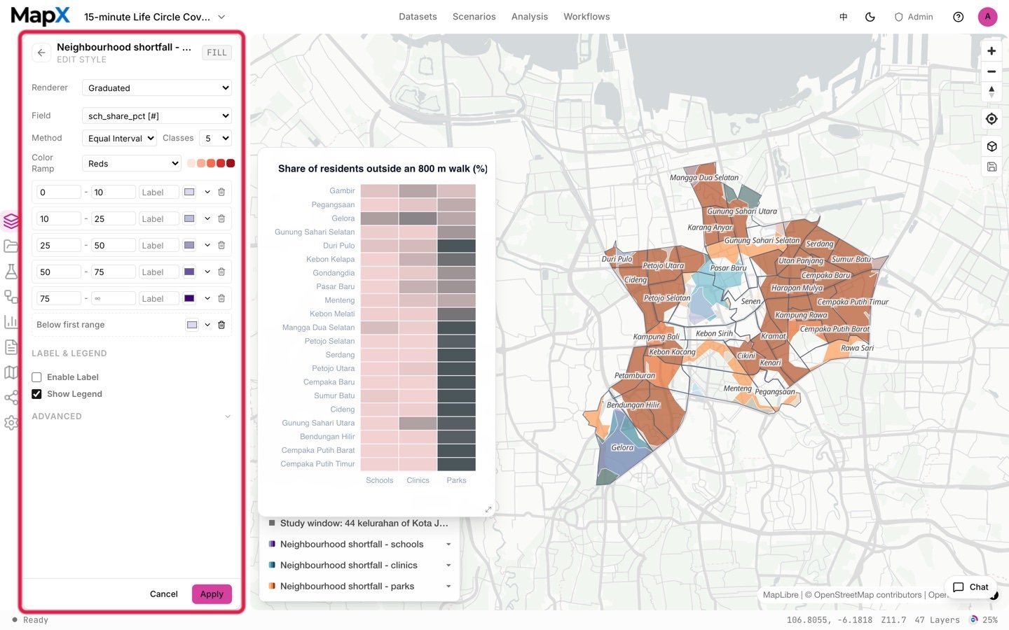
5. Turn the result into charts and a report
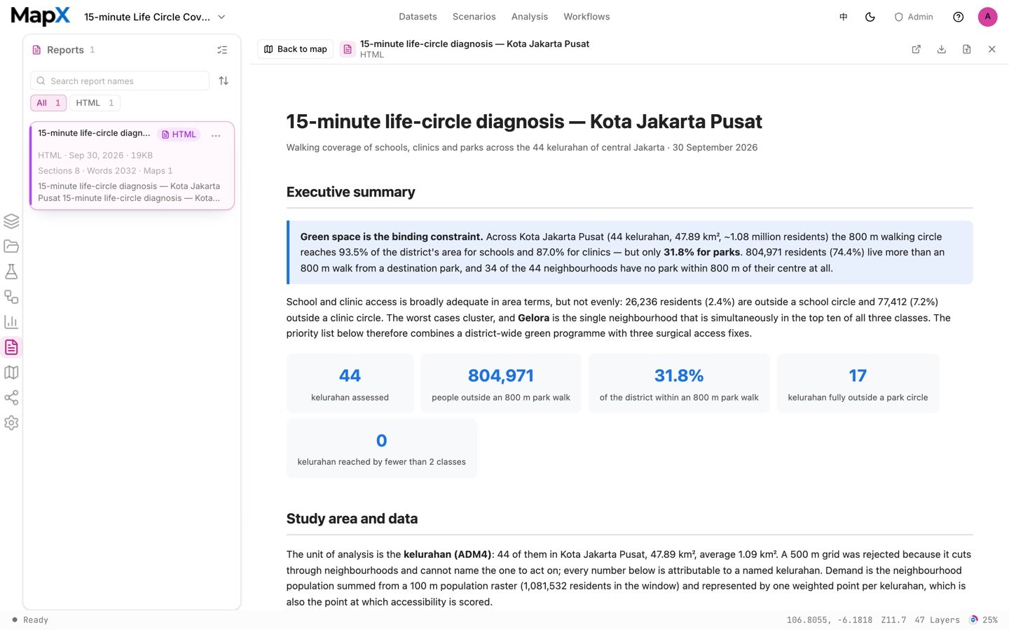
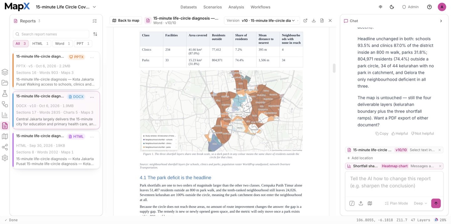
The run produces per-class rankings, a three-class comparison and a heatmap that can be pinned to the map while you pan the ramps. The report then names the priority neighbourhoods and states the radius, the park definition and the caveats. The same run can also export the report as a Word document for a formal submission or a slide deck for a presentation handoff.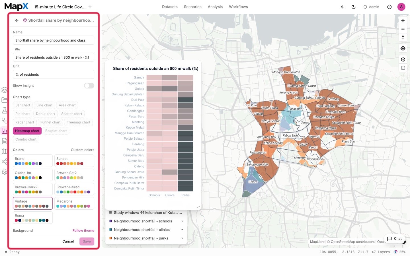
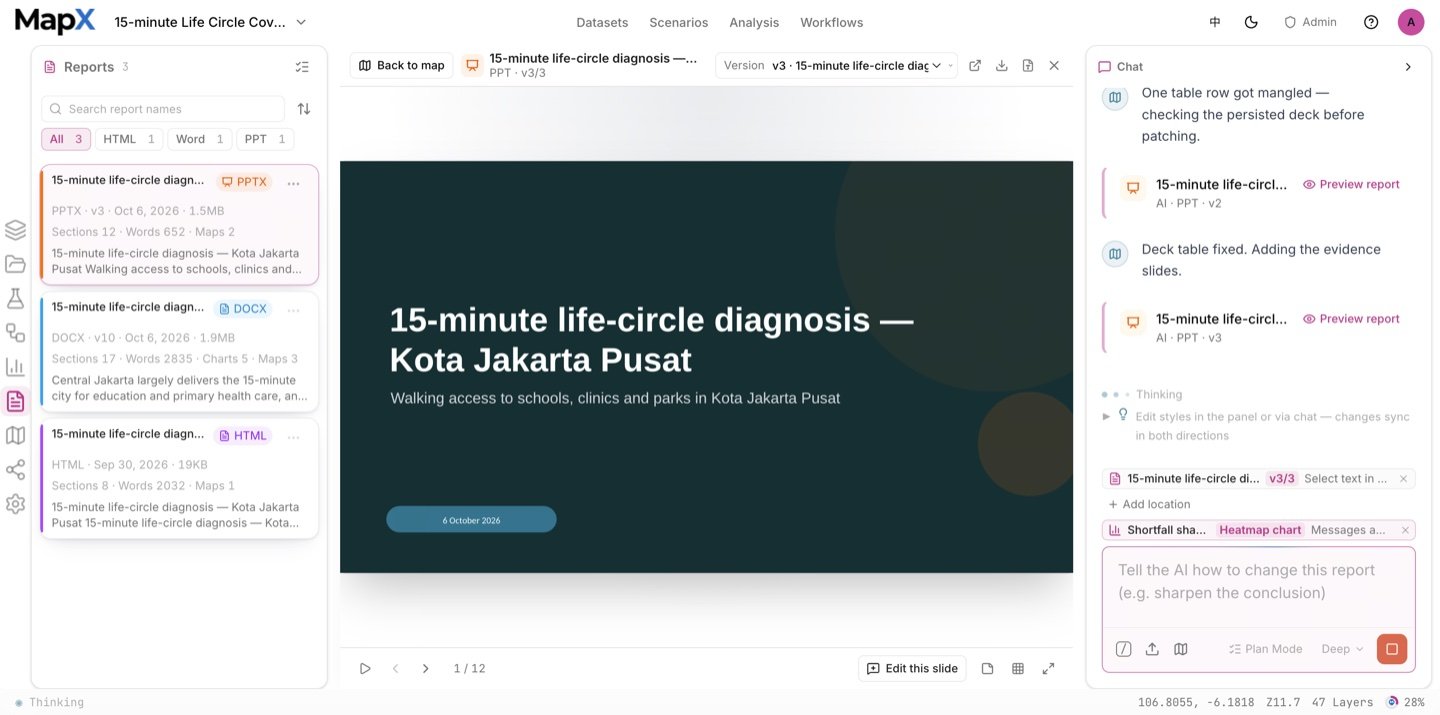
Example output
The screenshots above come from one example run with the default settings on the shipped data. They show the shape of the deliverables, not what your run will return.
- Layers — one neighbourhood shortfall layer per facility class, the accessibility scores, the top-10 rankings, the neighbourhood summary table as a layer, and the labelled boundary.
- Tables — the neighbourhood summary with population, coverage count and the three shortfall columns, plus the per-class rankings.
- Charts — three class rankings, a grouped comparison and a heatmap, all editable and pinnable.
- Report — the diagnosis document naming the priority neighbourhoods, with the radius, the park definition and the coverage caveats.
Related
- Scenarios — the full catalog and how scenarios work
- Public Facility Siting — turns the gaps into candidate sites
- Carrying Capacity Assessment — the same city, read through environmental constraints
- Analysis — service areas, accessibility and zonal statistics
- Charts — rankings and pinned comparison views