

What the scenario ships
Eight layers cover the Kigali window. Only land cover is visible by default; the other layers are analysis inputs and cross-checks.
All layers come from the built-in catalog with source and attribution attached, and they are not limited to Kigali: the catalog provides the same datasets for other cities at the same specification — switch the study area, add the same entries, and this chapter’s method chain transfers in minutes.
How the study works
In short, the study first builds spatial masks for each constraint — ecological space, steep slopes and riverbank corridors — and overlays them with the development surface to produce four conflict layers; it then summarises conflict area and affected population on a grid and ranks the worst patches; finally it issues remediation and avoidance guidance by conflict type and grade, delivering conflict layers, a ranking and a screening report.
Run it
The screenshots below come from this scenario’s reference workspace. Each step names the platform surface it uses, so you can follow the same path in your own project.1. Open the scenario
Open Scenarios in the top menu, select this card and choose Open scenario. The whole bundle imports at once: every layer keeps its default style, legend, source and attribution, and the camera flies to the study area. Use the Layers panel to switch layers on and off before you type anything.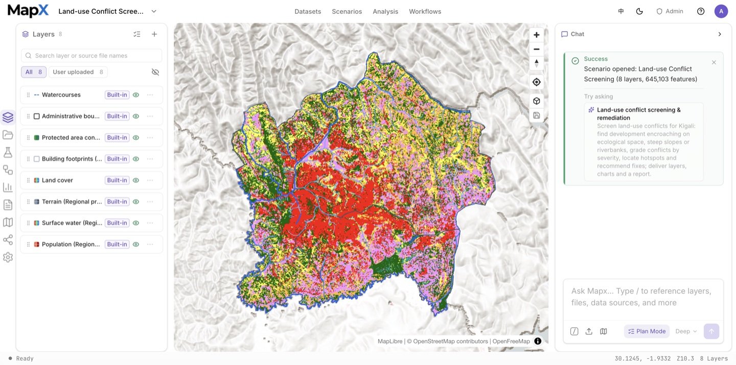
2. Ask the suggested question and review the plan
Send the suggested question in the box above — or edit it first. Plan mode records the ecological-space definition, the development surface and the rule that conflict families are reported per type plus a de-duplicated union.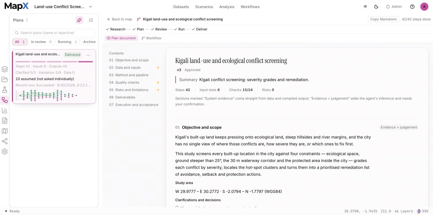
3. Approve the plan and run the analysis
The chain uses raster algebra and polygon conversion to build the ecological-space layer, Euclidean distance for the 100 m encroachment band and the 30 m waterway setback, buffering, slope reclassification, the steep-slope mask, and the 500 m grid where conflict area and exposed population are summed. The Analysis panel keeps every run’s operator, inputs, parameters and result layer, and the workflow graph in the centre visualises the whole chain.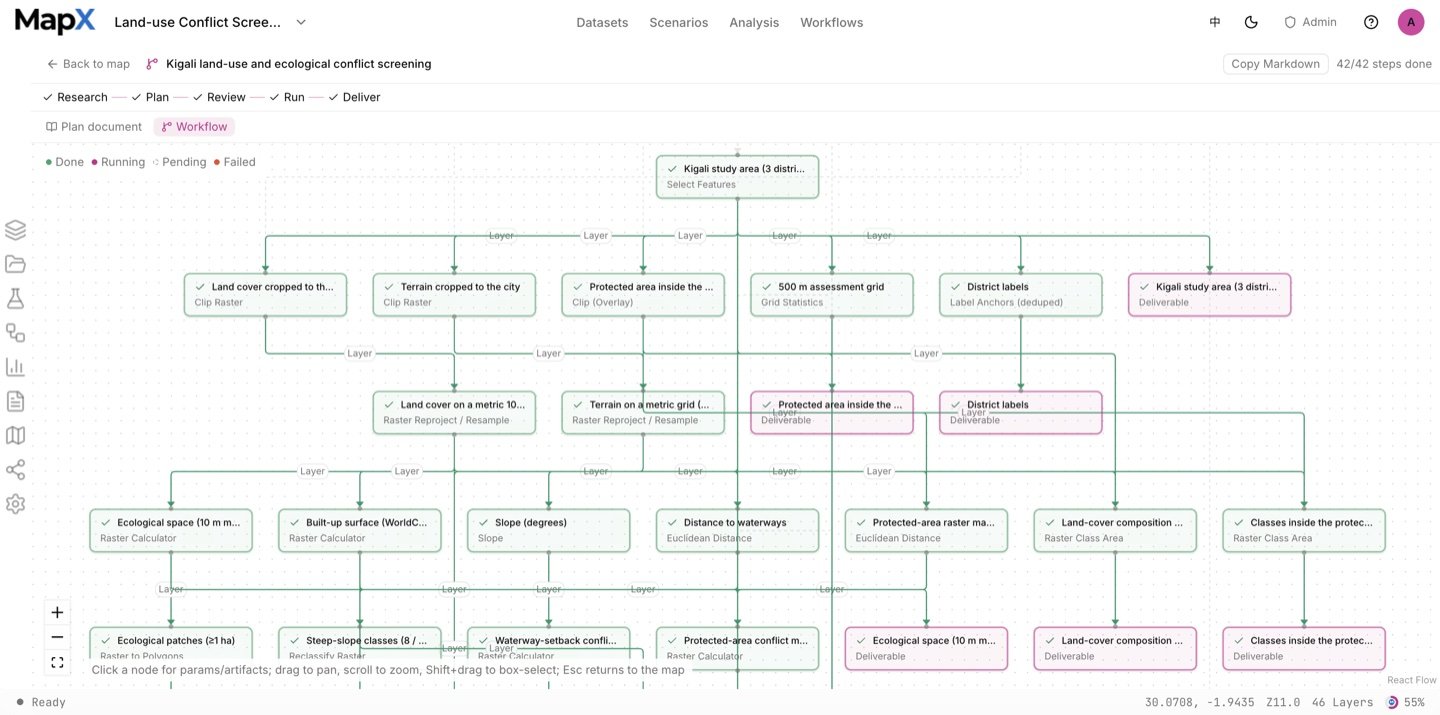
4. Style the result on the map
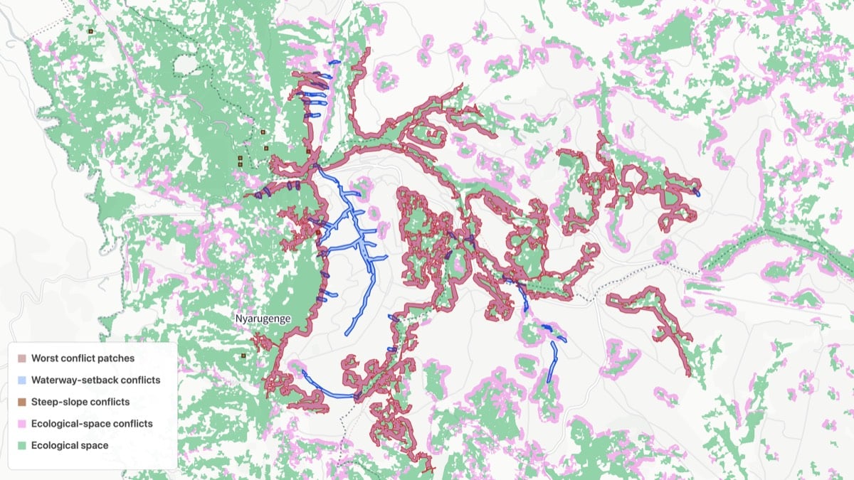
Each conflict family owns one hue so the four translucent layers stay readable together; the worst-patch ranking is styled as a dark-red fill with rank labels from an anchor layer, and legend titles carry the definitions.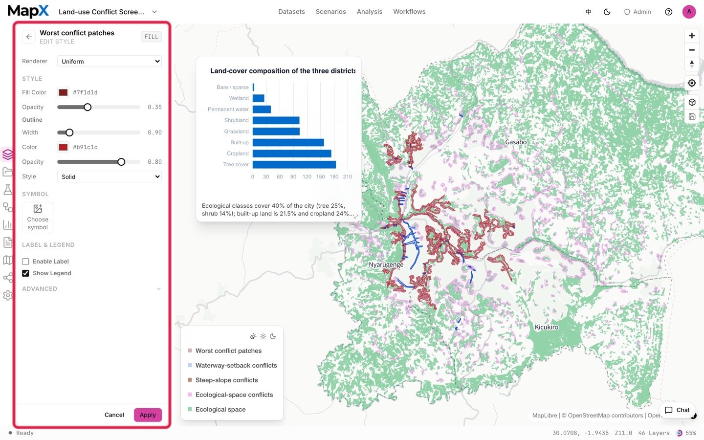
5. Turn the result into charts and a report
The run reports conflict area per family and the exposed population, with the union stated separately. The charts and the report quote those definitions rather than a single risk score.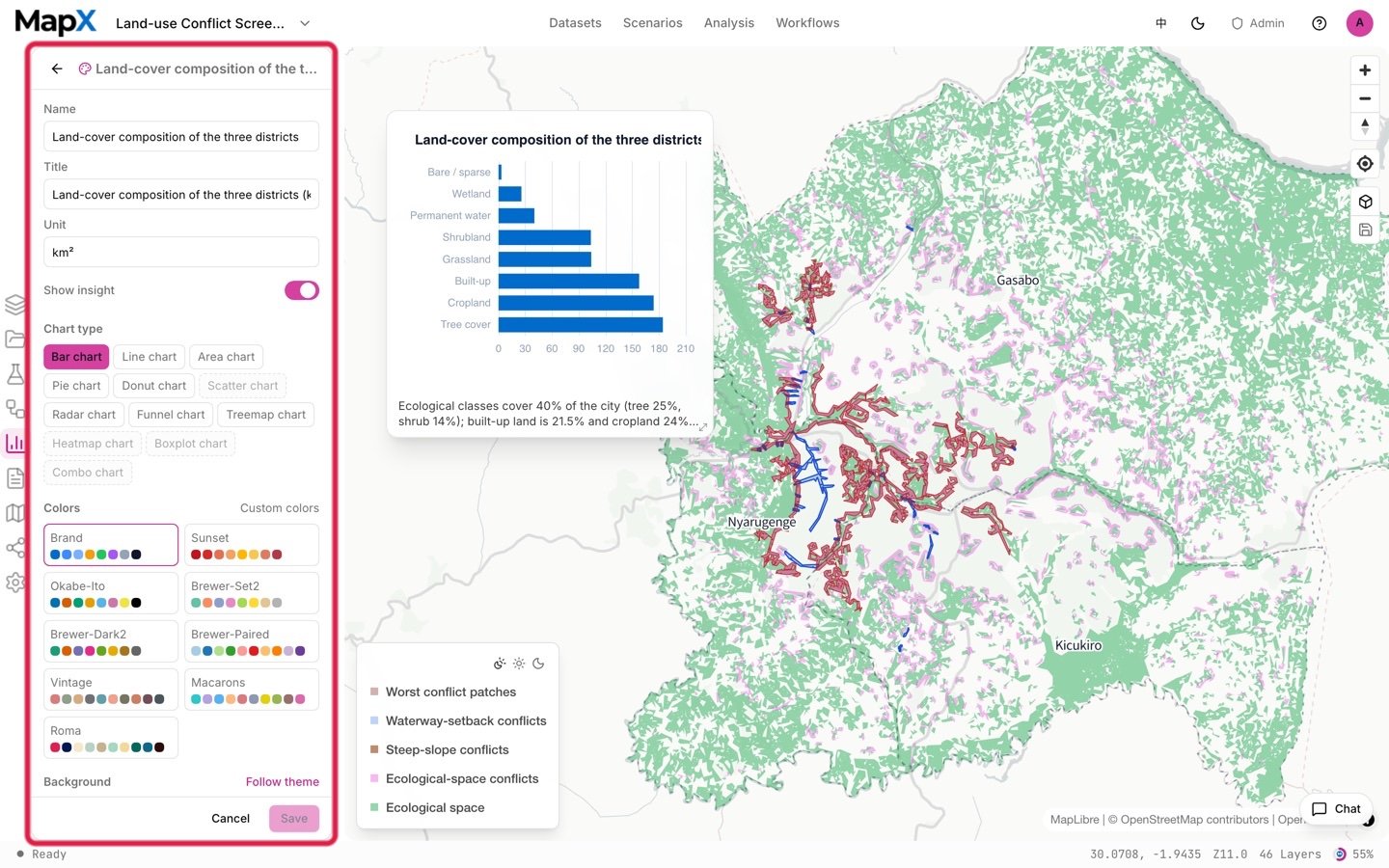
Example output
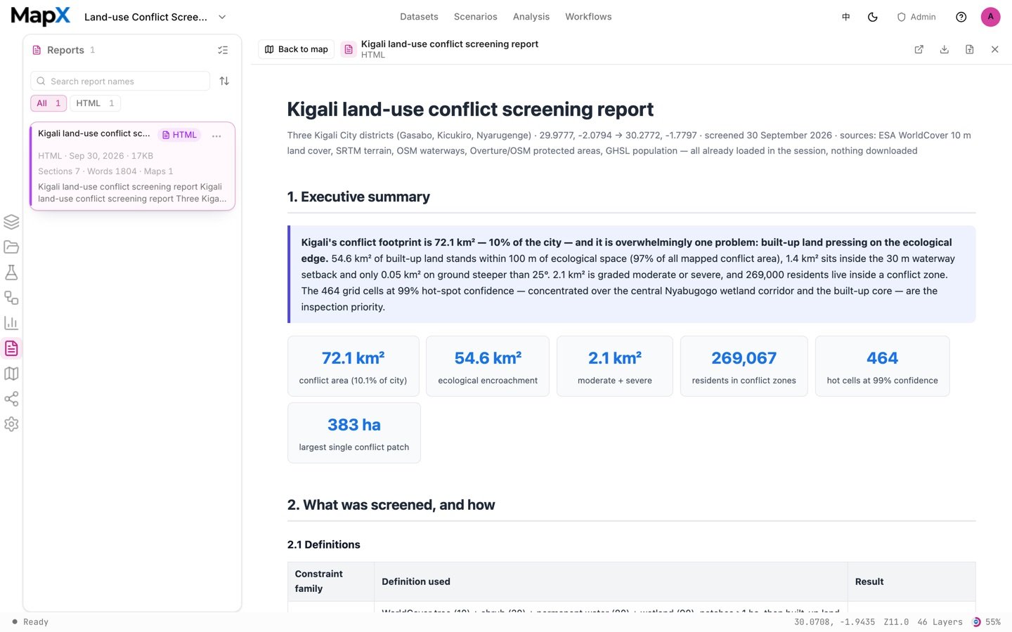
The screenshots above come from one example run with the default settings on the shipped data. They show the shape of the deliverables, not what your run will return.
- Layers — the ecological-space layer, the four conflict families (ecological encroachment, steep slope, waterway setback, protected area) and the worst-patch ranking, all with their definitions in the legend.
- Tables — the per-type conflict areas plus the de-duplicated union, and the exposed population per assessment cell.
- Charts — the conflict-area and exposure summaries, editable and ready for the report.
- Report — the compliance document with the definitions, the areas and the remediation guidance.
Related
- Scenarios — the full catalog and how scenarios work
- Development Suitability Baseline — the same constraints used to screen buildable land
- Carrying Capacity Assessment — constraint logic for water and climate
- Analysis — raster algebra, distance and overlay tools
- Built-in datasets — where every layer comes from