

What the scenario ships
Seven layers cover the Hanoi window. Only the built-up area is visible by default; the rest are context and analysis inputs.
All layers come from the built-in catalog with source and attribution attached, and they are not limited to Hanoi: the catalog provides the same datasets for other cities at the same specification — switch the study area, add the same entries, and this chapter’s method chain transfers in minutes.
How the study works
In short, the study first reconstructs built-up expansion phase by phase, measuring new area, speed and intensity per period; it then classifies each new patch as infill, edge or leapfrog from how it touches the earlier built-up mask, and describes direction with the gravity centre and a standard deviational ellipse; finally it crosses growth with population and night lights in a quadrant grid to flag growth-management priorities, delivering phase layers, indicator tables and a report.
Run it
The screenshots below come from this scenario’s reference workspace. Each step names the platform surface it uses, so you can follow the same path in your own project.1. Open the scenario
Open Scenarios in the top menu, select this card and choose Open scenario. The whole bundle imports at once: every layer keeps its default style, legend, source and attribution, and the camera flies to the study area. Use the Layers panel to switch layers on and off before you type anything.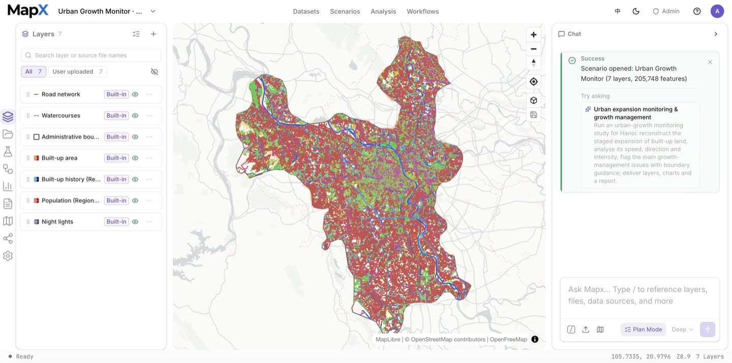
2. Ask the suggested question and review the plan
Send the suggested question in the box above — or edit it first. Plan mode confirms the study area, the two mask years used for the form measurement and the report numbers before anything runs.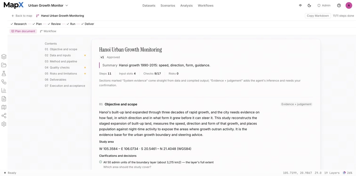
3. Approve the plan and run the analysis
The run chains deterministic analysis tools: the phased expansion metrics, the landscape expansion index between the two built-up masks, polygon conversion for the form layer, the gravity centre and standard deviational ellipse, and the 1 km grid with population and night-light quadrants. The Analysis panel keeps every run’s operator, inputs, parameters and result layer, and the workflow graph in the centre visualises the whole chain.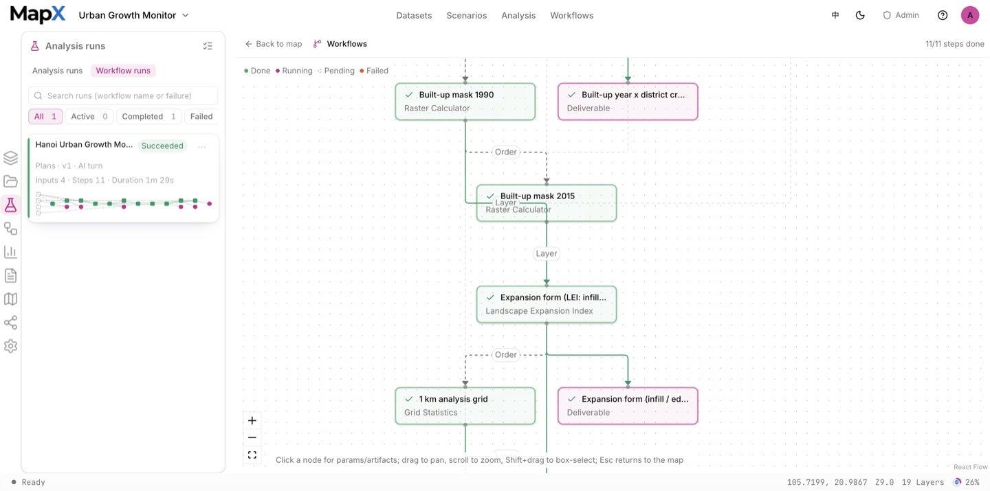
4. Style the result on the map
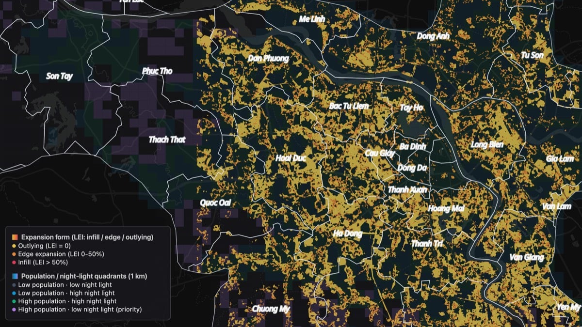
The expansion-form layer keeps three human-readable classes on the dark basemap, with the quadrant grid and district labels as light references; the layer style editor is where the hue family and label halo are set.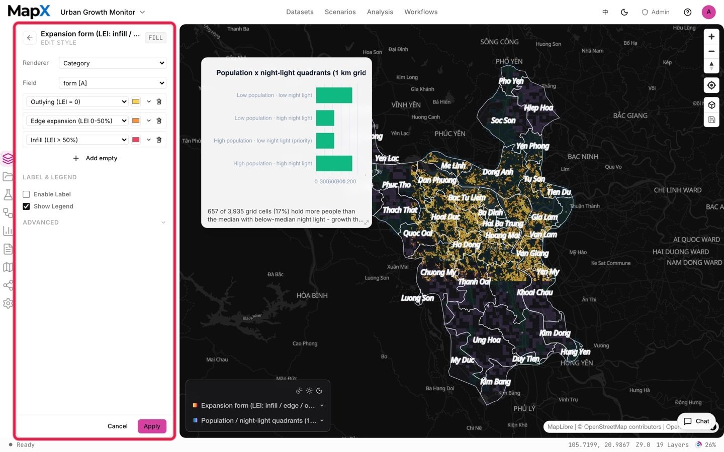
5. Turn the result into charts and a report
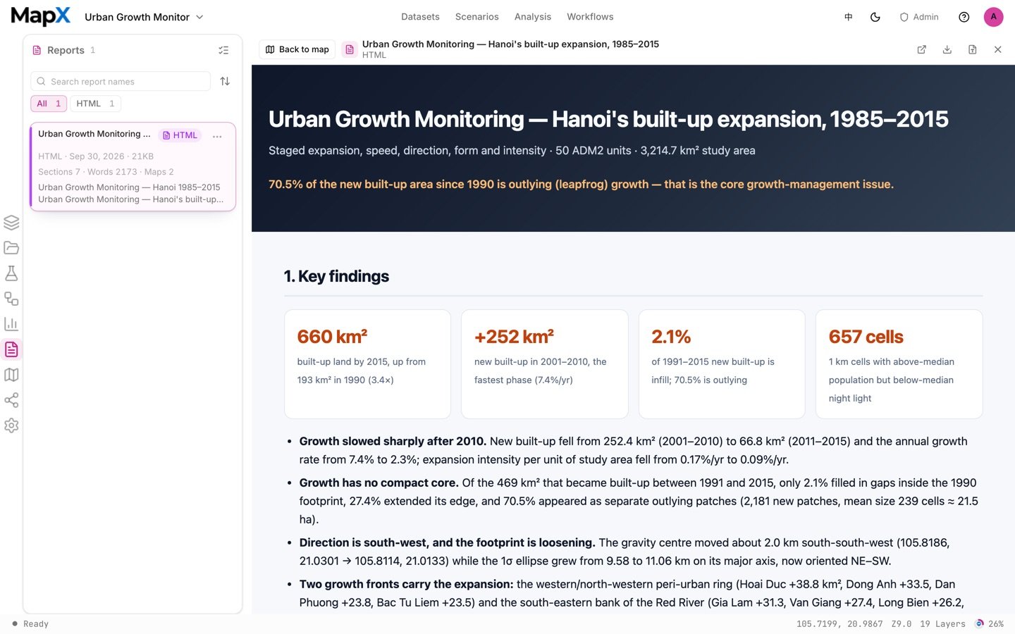
The run produces a dual-axis growth chart, a form-composition donut and a quadrant distribution. All are charts you can restyle or pin, and the report records the phase table, the form shares and the year-mismatch caveats.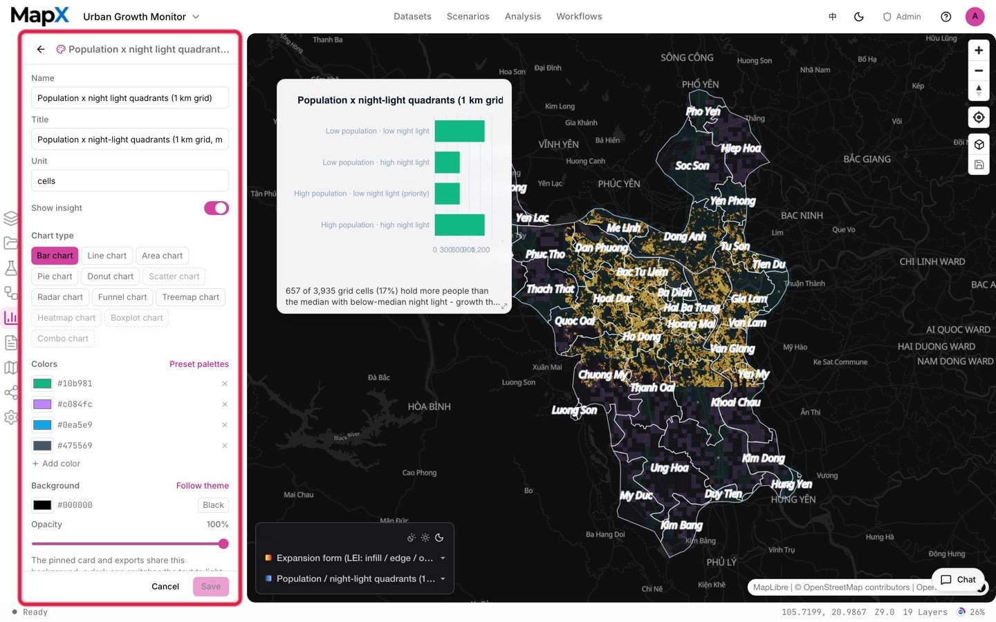
Example output
The screenshots above come from one example run with the default settings on the shipped data. They show the shape of the deliverables, not what your run will return.
- Layers — the expansion-form layer (infill, edge, outlying), the population and night-light quadrant grid, the phase rasters as context and a labelled district reference.
- Tables — the phase metrics (new area, annual growth, intensity, compactness, centre and ellipse) and the built-year cross table.
- Charts — the phase growth chart, the expansion-form donut and the quadrant distribution.
- Report — the growth-monitoring document with the phase definitions and the reference-year caveats.
Related
- Scenarios — the full catalog and how scenarios work
- Development Suitability Baseline — where growth can be steered
- Public Facility Siting — siting the services that follow growth
- Charts — dual-axis, donut and ranking views
- Reports — packaging the growth-management reading