

What the scenario ships
Seven layers cover the Dar es Salaam region.
All layers come from the built-in catalog with source and attribution attached, and they are not limited to Dar es Salaam: the catalog provides the same datasets for other cities at the same specification — switch the study area, add the same entries, and this chapter’s method chain transfers in minutes.
How the study works
In short, the study first audits the existing schools and clinics against their service standards to locate shortfall wards and unserved population; it then screens candidate grid cells inside the worst wards for setback and build-out conditions; finally a maximum-coverage model picks the recommended sites that serve the most unserved residents, with a second model as an efficiency reference, delivering recommended sites, a marginal coverage curve and a report.
Run it
The screenshots below come from this scenario’s reference workspace. Each step names the platform surface it uses, so you can follow the same path in your own project.1. Open the scenario
Open Scenarios in the top menu, select this card and choose Open scenario. The whole bundle imports at once: every layer keeps its default style, legend, source and attribution, and the camera flies to the study area. Use the Layers panel to switch layers on and off before you type anything.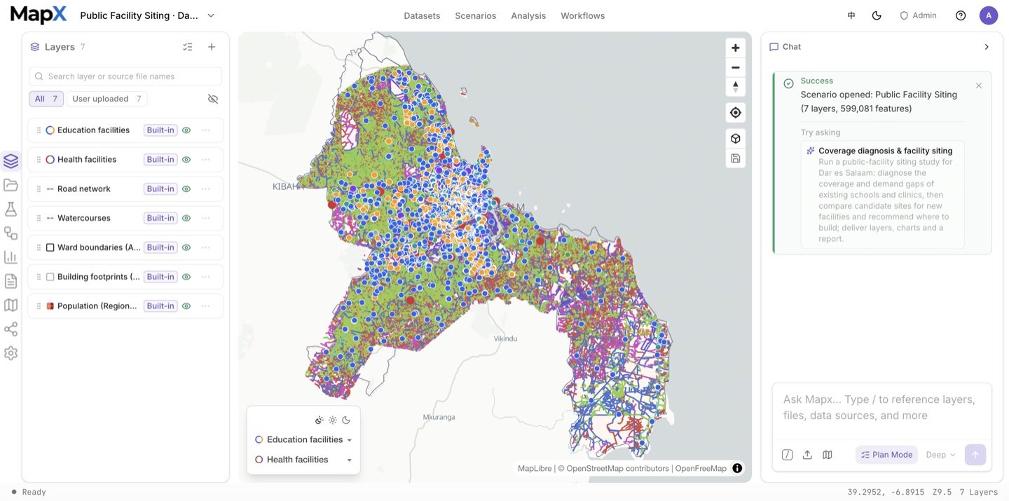
2. Ask the suggested question and review the plan
Send the suggested question in the box above — or edit it first. Plan mode records the supply-set definitions, the radius per class, the demand basis, the number of sites and the report language before the run starts.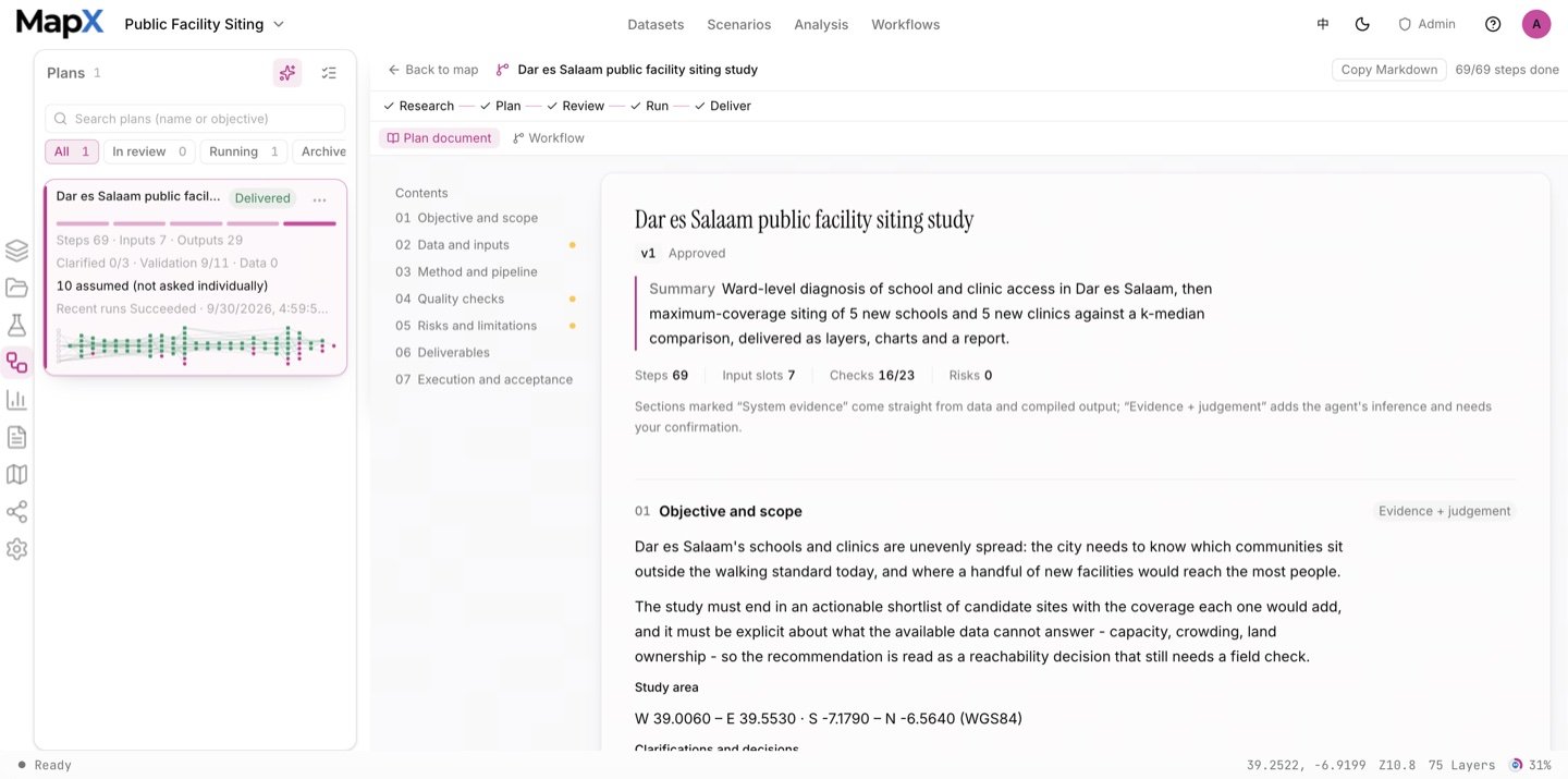
3. Approve the plan and run the analysis
The chain screens the supply set by facility class, builds the status-quo service areas (800 m schools, 1000 m clinics), erases them from the wards to get the shortfall, prepares the unserved demand on a grid, screens the candidate cells and then runs the two siting models: maximum coverage (MCLP) as the recommendation and k-median as the efficiency comparison. The Analysis panel keeps every run’s operator, inputs, parameters and result layer, and the workflow graph in the centre visualises the whole chain.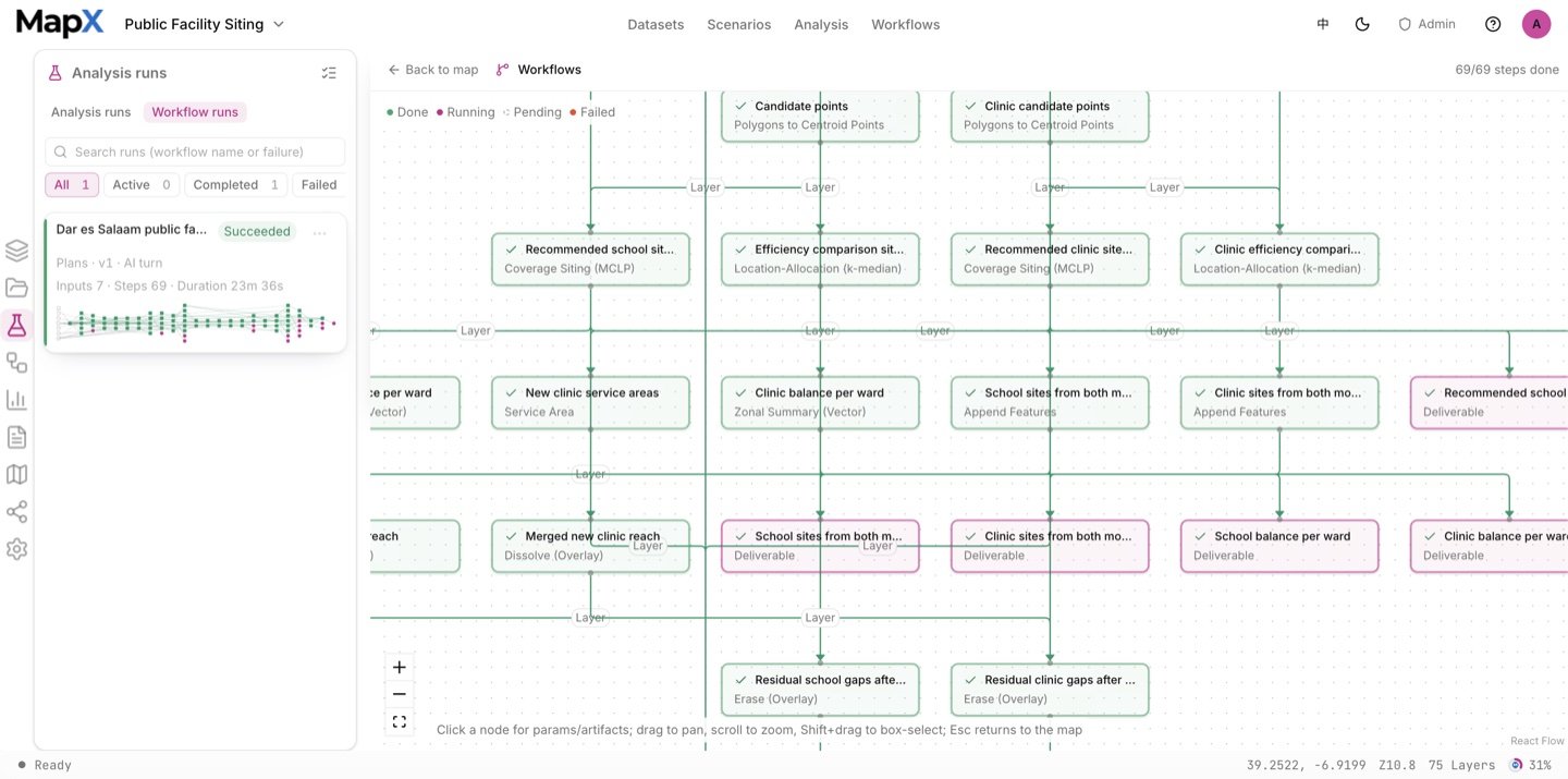
4. Style the result on the map
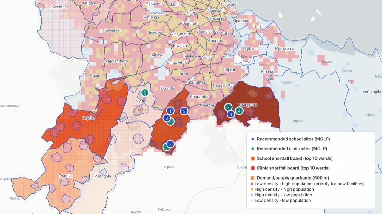
Recommended sites are ranked circles in the class hue, the shortfall rankings and demand/supply quadrants stay as hidden reference layers, and the legend states which model each marker belongs to.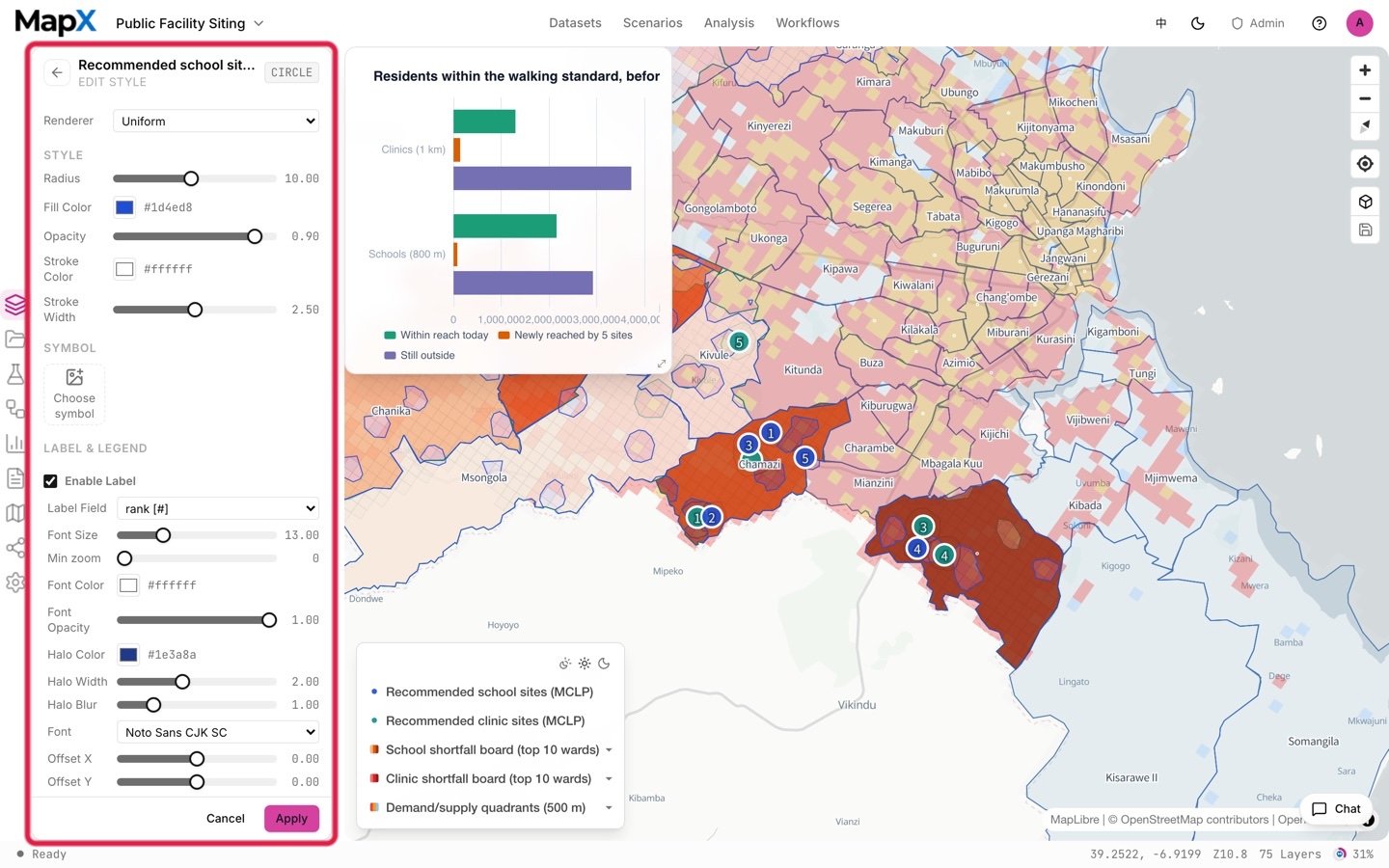
5. Turn the result into charts and a report
The marginal coverage curve answers whether the next site still earns its place, and the before/after bars show what the recommended sites add. Both are charts; the report carries the before/after pair and every disclosure about capacity, crowding and fairness.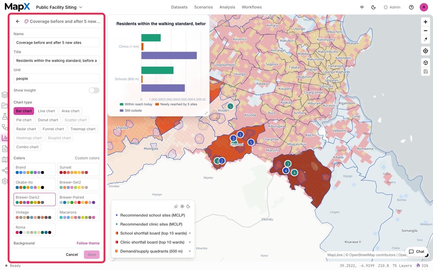
Example output
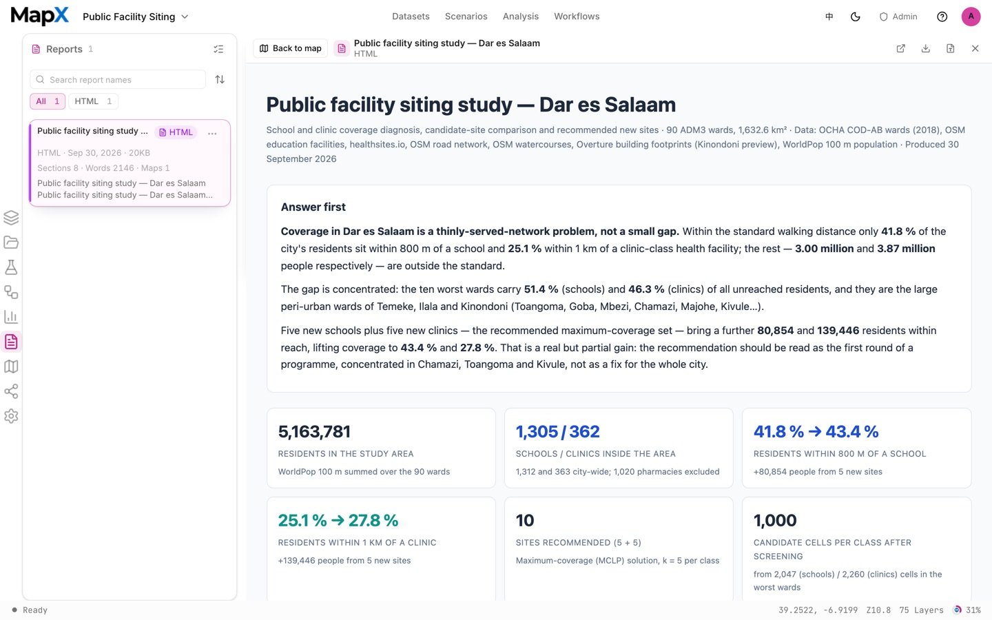
The screenshots above come from one example run with the default settings on the shipped data. They show the shape of the deliverables, not what your run will return.
- Layers — the recommended sites for each facility class, the comparison sites, their service areas, the residual gaps, the shortfall rankings and the demand/supply quadrants.
- Tables — the ward balance table, the selected-site list and the feasibility counts for the candidate filters.
- Charts — the marginal coverage curve and the before/after coverage comparison.
- Report — the siting study with the supply-set definitions, the before/after pair and the capacity, crowding and fairness disclosures.
Related
- Scenarios — the full catalog and how scenarios work
- 15-minute Neighbourhood Coverage — the coverage audit that motivates siting
- Urban Growth Monitor — where growth is heading, for forward-looking siting
- Analysis — network and overlay tools, scale guards and run semantics
- Reports — assembling the siting package