

What the scenario ships
Six prepared layers cover the Jakarta window.
All layers come from the built-in catalog with source and attribution attached, and they are not limited to Jakarta: the catalog provides the same datasets for other cities at the same specification — switch the study area, add the same entries, and this chapter’s method chain transfers in minutes.
How the study works
The design follows the “shortest stave” reading of carrying capacity: the most limiting factor decides the class, not the average.
In short, the study first converts the four constraints — terrain, wetness, flood and rainfall — into comparable membership scores and composes them into capacity classes on a shortest-stave rule; it then crosses the classes with population in a quadrant read to find the overloaded cells where capacity is low and pressure high; finally it breaks down the dominant limiting factor per district and assembles the classes, overload grid and measures into charts and a report.
Run it
The screenshots below come from this scenario’s reference workspace. Each step names the platform surface it uses, so you can follow the same path in your own project.1. Open the scenario
Open Scenarios in the top menu, select this card and choose Open scenario. The whole bundle imports at once: every layer keeps its default style, legend, source and attribution, and the camera flies to the study area. Use the Layers panel to switch layers on and off before you type anything.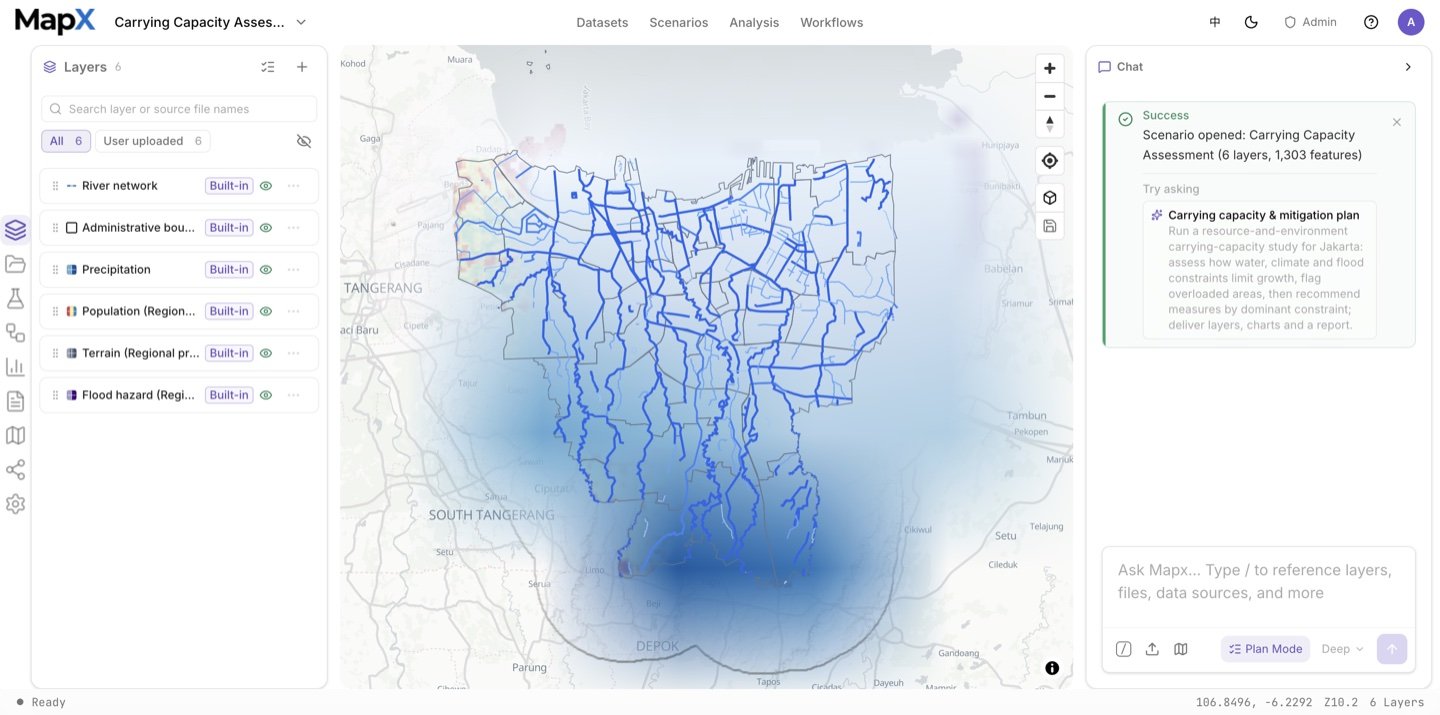
2. Ask the suggested question and review the plan
Send the suggested question in the box above — or edit it first. Plan mode asks how to read the study extent, whether to use the strict limiting-factor rule or the compensating variant, and which numbers the report should quote — then writes the plan document with its data inputs, method, quality checks, risks and deliverables.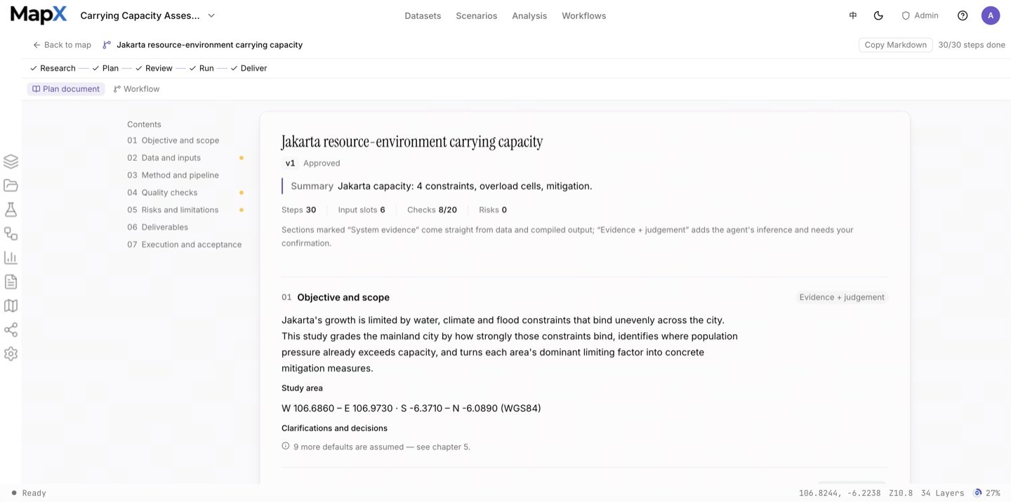
3. Approve the plan and run the analysis
The run chains deterministic analysis tools: slope and topographic wetness, fuzzy membership for each limiting factor, focal-statistics repair for the two disclosed input gaps, the limiting-factor composite (shortest stave), the 300 m drainage corridor, the 1 km grid, zonal statistics and the pressure quadrant. The Analysis panel keeps every run’s operator, inputs, parameters and result layer, and the workflow graph in the centre visualises the whole chain.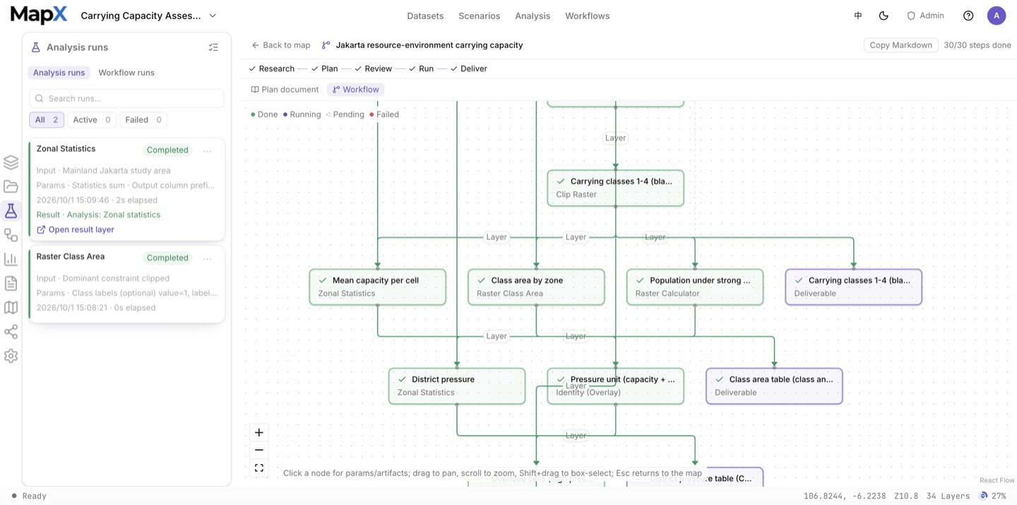
4. Style the result on the map
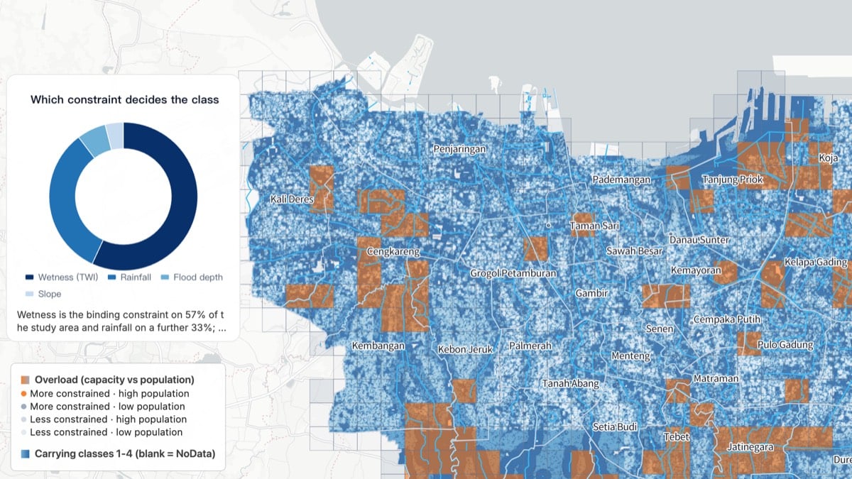
The carrying classes use a reversed blue ramp so the most constrained land is the darkest; the overload cells sit on top in orange, and district labels come from an anchor layer instead of the boundary polygons.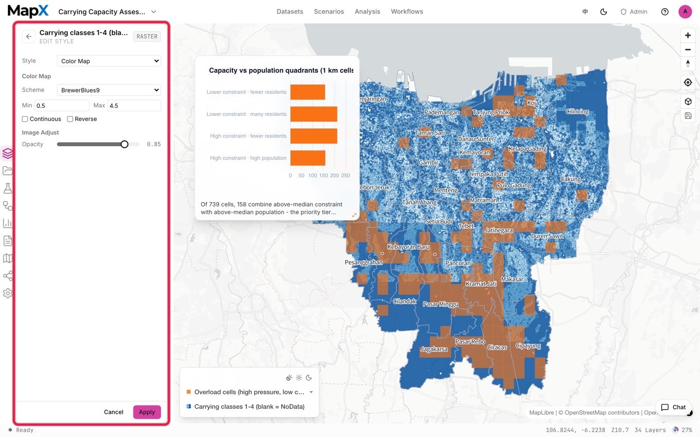
5. Turn the result into charts and a report
The constraint-composition chart answers which factor decides each class, and the district charts rank the pressure. Both are charts you can restyle or pin, and the report collects the threshold table, the coverage statement and the class shares in one document.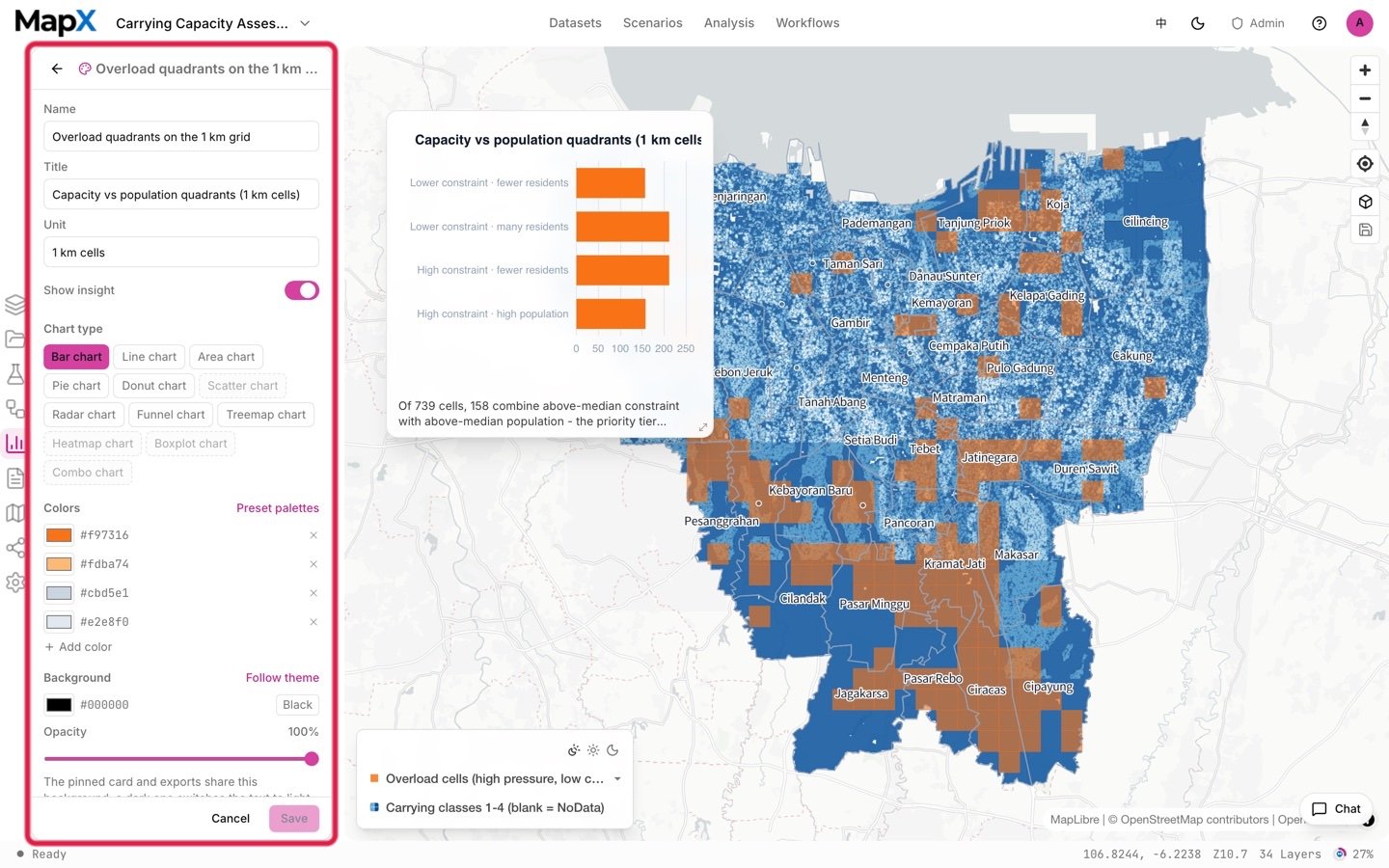
Example output
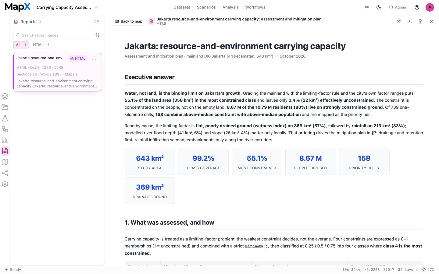
The screenshots above come from one example run with the default settings on the shipped data. They show the shape of the deliverables, not what your run will return.
- Layers — the four-class carrying-capacity raster with the drainage-corridor adjustment, the overload cells, the 1 km population grid and the district label layer.
- Tables — the class-area table with its admin cross table, the dominant-constraint table and the district pressure list.
- Charts — the constraint-composition chart and the pressure ranking, editable and ready to pin.
- Report — the assessment document with the threshold table, the data-repair statement and the five acceptance checks.
Related
- Scenarios — the full catalog and how scenarios work
- Development Suitability Baseline — the companion suitability study for Nairobi
- Land-use Conflict Screening — constraint logic applied to built-up land
- Analysis — fuzzy overlay, raster calculator and statistics tools
- Built-in datasets — where every layer comes from