

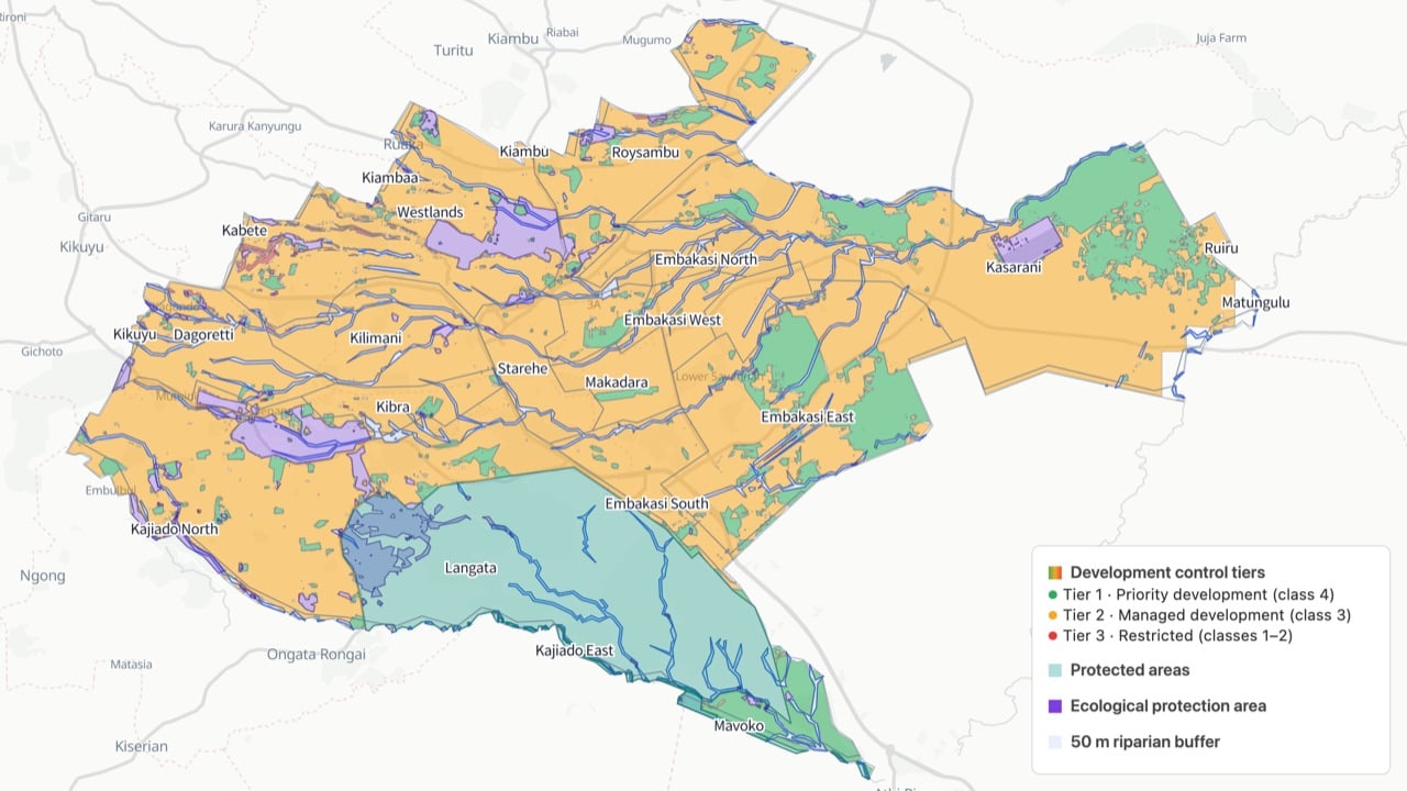
What the scenario ships
Opening the scenario imports eight prepared layers for the Nairobi window. Every layer comes from the built-in datasets catalog with its default style, legend, source, licence and attribution attached.
All layers come from the built-in catalog with source and attribution attached, and they are not limited to Nairobi: the catalog provides the same datasets for other cities at the same specification — switch the study area, add the same entries, and this chapter’s method chain transfers in minutes.
The layer order is the display order: points, then lines, then polygons, then rasters. All eight stay in the project for follow-up questions; only the surfaces you see in the legend above are styled as deliverables.
How the study works
The method is a chain of three planning questions. Each one maps onto deterministic analysis tools, so every number in the report can be traced back to a run.
In short, the study first subtracts the no-build space — ecological protection, steep slopes and the riparian buffer — from the study area, then grades the remaining land into four suitability classes with a weighted overlay and estimates carrying capacity per evaluation cell, and finally vectorises the result into three development control tiers (priority, managed, restricted) with charts and a report. The three stages share one deterministic operator chain: each stage’s output layer is the next stage’s input.
Run it
The screenshots below come from this scenario’s reference workspace. Each step names the platform surface it uses, so you can follow the same path in your own project.1. Open the scenario
Open Scenarios in the top menu, select this card and choose Open scenario. The whole bundle imports at once: every layer keeps its default style, legend, source and attribution, and the camera flies to the study area. Use the Layers panel to switch layers on and off before you type anything.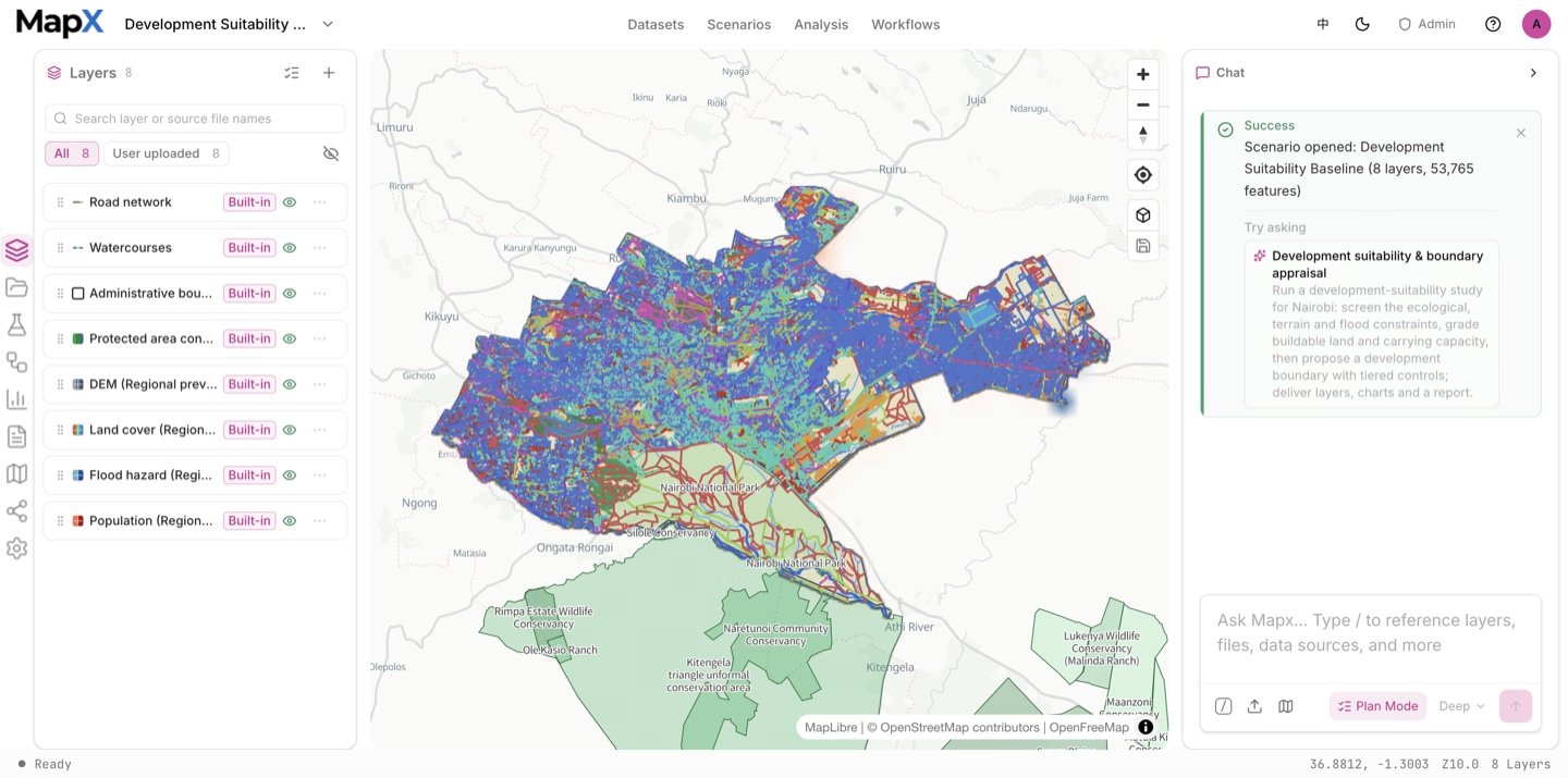
2. Ask the suggested question and review the plan
Send the suggested question in the box above — or edit it first. Plan mode turns it into a reviewable plan: the AI asks which admin units and constraints to use and whether the ecological mask is a hard exclusion, then writes the plan document — objective and scope, data inputs, method and pipeline, quality checks, risks, deliverables and execution. Every section is marked as system evidence or evidence + judgement, and the assumptions are listed before anything runs.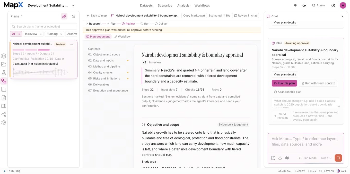
3. Approve the plan and run the analysis
Approving the plan starts a chain of deterministic analysis tools: slope and reclassification, raster calculator masks for the ecological protection area, buffering along waterways, overlay erase for the hard exclusions, the 1 km evaluation grid and zonal statistics. The Analysis panel keeps the operator, inputs, parameters, status and result layer of every run, and the workflow graph in the centre visualises the whole chain, so each number in the report can be traced back to a step.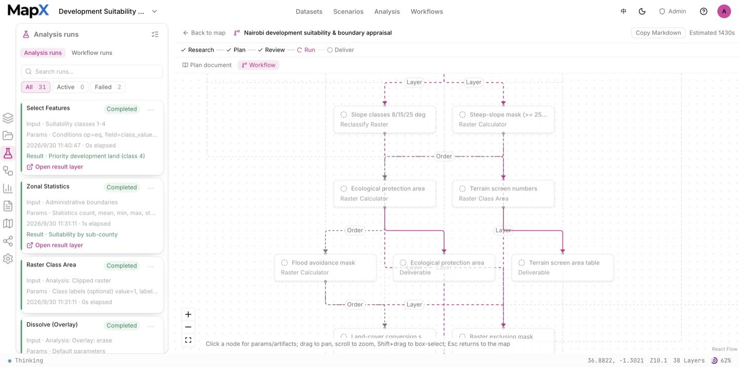
4. Style the result on the map
The layers arrive styled, and the layer style editor lets you change the renderer, colours, opacity, outline, labels and legend without writing code. Here the development control tiers keep human-readable class names, labels come from an anchor layer, and the constraint layers stay translucent so the tiers remain the strongest signal.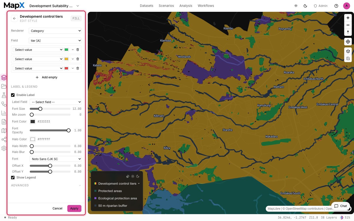
5. Turn the result into charts and a report
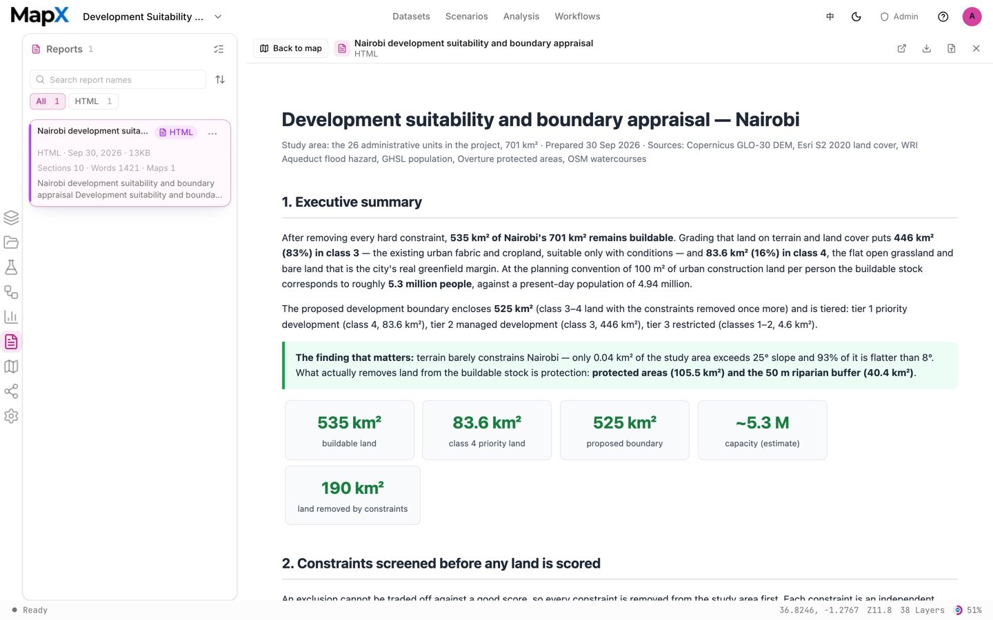
Any result can become a chart — donut, pie, bar, heatmap, combo and more — with palettes, axis options and the choice to pin it to the map. The report canvas then combines the map, the charts and the tables into one document you can preview, revise and export; the same run can also produce a Word report for a formal submission.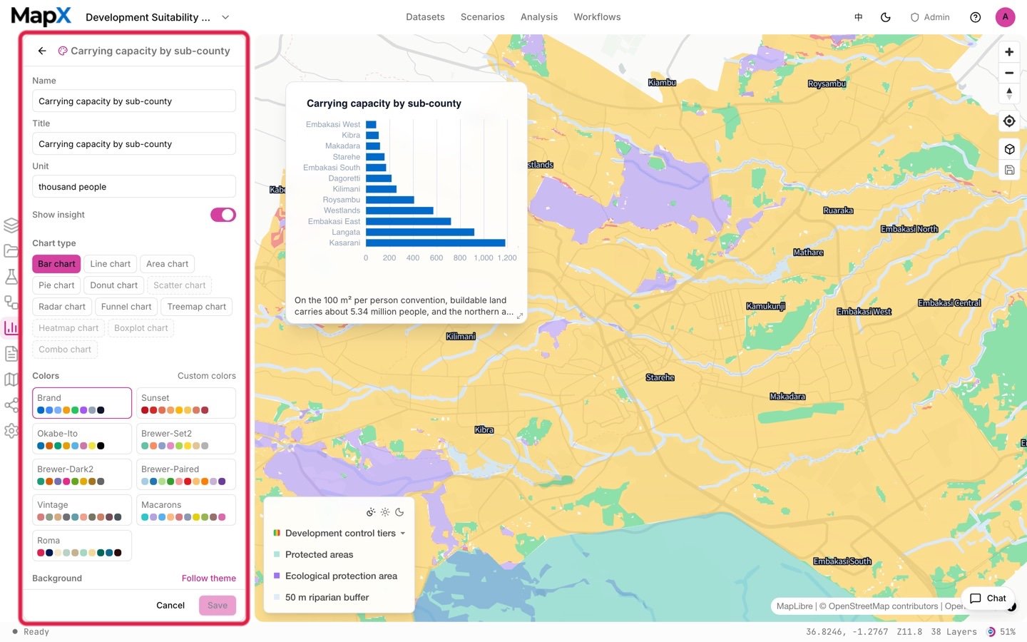
Example output
The screenshots above come from one example run with the default settings on the shipped data. They show the shape of the deliverables, not what your run will return.
- Layers — the buildable-land result, the suitability classes and the development control tiers, plus the constraint layers (ecological protection, protected areas, riparian buffer) as styled, legend-ready map layers.
- Tables — class areas with an admin cross table, the population per evaluation cell, and the district-level summary.
- Charts — the class-area composition, the constraints screened and the capacity ranking, each editable and pinnable.
- Report — an assessment document that combines the map, the figures and the threshold table, ready to share or export.
Related
- Scenarios — the full catalog and how scenarios work
- Carrying Capacity Assessment — the companion study for water, climate and flood constraints
- Land-use Conflict Screening — the same constraint logic applied to built-up land
- Built-in datasets — where every layer comes from
- Analysis — the tools behind each step
- Reports — how the deliverable is assembled and exported